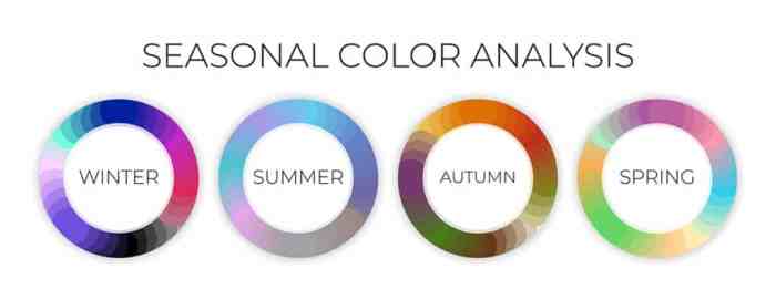
Seasonal color palettes are more than just a trend – they’re a creative powerhouse shaping industries like fashion, design, and marketing. Buckle up as we dive into the vibrant world of colors that define each season.
Seasonal Color Palettes

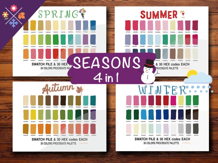
Seasonal color palettes in fashion and design refer to the specific color schemes that are popular and trending during different seasons of the year. These palettes are inspired by the colors found in nature during each season and are used to create cohesive and visually appealing designs.
Popular Color Palettes for Different Seasons
- Spring: Pastel colors like blush pink, mint green, and sky blue are commonly used in spring color palettes to evoke a sense of freshness and renewal.
- Summer: Bright and vibrant colors such as coral, turquoise, and sunny yellow dominate summer color palettes, reflecting the warmth and energy of the season.
- Fall: Earthy tones like rust orange, olive green, and mustard yellow are popular in fall color palettes, mirroring the changing colors of leaves during autumn.
- Winter: Cool tones like icy blue, deep burgundy, and forest green are key elements of winter color palettes, capturing the cold and cozy atmosphere of the season.
Influence of Seasonal Color Palettes on Trends
Seasonal color palettes play a significant role in influencing trends across various industries. In interior design, these palettes dictate the colors of furniture, decor, and paint choices for each season. Graphic designers use seasonal color palettes to create visually appealing designs for websites, logos, and marketing materials. Marketers leverage these palettes to evoke specific emotions and associations in their advertising campaigns, influencing consumer behavior and brand perception.
Creating Seasonal Color Palettes
Creating a seasonal color palette involves carefully selecting a range of colors that evoke the feeling and essence of a particular season. These palettes are used in various industries such as fashion, interior design, graphic design, and more to create cohesive and visually appealing looks that resonate with the time of year.
Selecting Colors for a Seasonal Palette
When choosing colors for a seasonal palette, it’s essential to consider the colors commonly associated with that season. For example, warm tones like reds, oranges, and yellows are often used for fall palettes, while cool tones like blues and whites are popular for winter palettes. Look to nature for inspiration, such as the changing leaves in autumn or the blooming flowers in spring.
- Consider the emotions and moods you want to convey with the palette.
- Think about the overall theme or concept you’re trying to capture.
- Experiment with different shades and tones to find the right balance.
Harmonizing Colors within a Palette
To create a cohesive look, it’s important to harmonize the colors within a palette. This can be achieved by following color theory principles such as complementary, analogous, or monochromatic color schemes. By choosing colors that are harmonious and work well together, you can ensure a visually pleasing result.
- Use a dominant color as the base and accent with complementary or analogous colors.
- Aim for a balance of light and dark shades to create depth and interest.
- Consider the proportions of each color within the palette to maintain harmony.
Considering Cultural Influences and Regional Variations
Cultural influences and regional variations play a significant role in creating seasonal color schemes. Different cultures may have unique associations with certain colors, and regions around the world may experience seasons differently. It’s essential to take these factors into account to ensure that your color palette resonates with your target audience.
- Research cultural symbols and meanings associated with colors to avoid unintended connotations.
- Adapt your palette to suit the preferences and sensibilities of different regions or markets.
- Be mindful of how seasonal changes manifest in various parts of the world and adjust your colors accordingly.
Application of Seasonal Color Palettes

Seasonal color palettes are not just limited to the world of design. They play a crucial role in various contexts such as fashion collections, branding, and seasonal decorations. Let’s dive into how these color schemes are effectively used in different industries to captivate audiences and create unforgettable experiences.
Fashion Collections
When it comes to fashion, seasonal color palettes are essential in setting trends and creating cohesive collections. Designers carefully select colors that reflect the mood of a particular season, whether it’s the warm hues of fall or the pastel tones of spring. For example, the renowned fashion house Gucci often incorporates rich jewel tones in their fall collections to evoke a sense of luxury and opulence.
Branding
In branding, seasonal color palettes help companies stay relevant and connect with their target audience. By incorporating colors associated with a specific season, brands can create a sense of familiarity and seasonal cheer. Starbucks, for instance, uses shades of green and red during the holiday season to evoke feelings of warmth and celebration among customers.
Seasonal Decorations
Seasonal color palettes are also utilized in seasonal decorations to enhance the festive atmosphere. From Christmas ornaments to Halloween decorations, the use of specific color schemes helps create a cohesive and visually appealing look. Retailers like Target leverage vibrant colors like orange and black during Halloween to create a spooky yet fun shopping experience for customers.
Trends in Seasonal Color Palettes
Seasonal color palettes play a significant role in various industries, influencing product design, fashion trends, interior decor, and more. Let’s explore the current trends in seasonal color palettes and how they are shaped by global events and cultural shifts.
Fashion Industry
In the fashion industry, color trends are often influenced by runway shows, designer collections, and the Pantone Color Institute’s Color of the Year. Currently, we see a rise in earthy tones, pastel shades, and bold pops of color like neon green and coral.
Interior Design
For interior design, trends in seasonal color palettes are leaning towards calming blues, nature-inspired greens, and warm neutrals. These colors create a sense of tranquility and connection to the outdoors, reflecting a growing desire for comfort and sustainability.
Graphic Design, Seasonal color palettes
In graphic design, the use of vibrant hues, gradient transitions, and monochromatic schemes is on the rise. This allows brands to stand out in a crowded digital landscape and adapt their visual identity to changing consumer preferences.
Predictions for Upcoming Season
Based on current market indicators and consumer behavior, we can expect to see a shift towards energizing colors like bright yellows, rich terracotta, and deep jewel tones for the upcoming season. These hues are likely to evoke feelings of optimism, warmth, and creativity in response to the current global climate.